I dont want to come off as mean or dis-respectful but there are some mapping choices that I find to be bad or questionable, but thats not to say the map is bad, its just that some areas are really weird and there's some weird decisions. I will provide feedback on how the problems / areas I dislike could be improved.
One of the bigger issues I see, Why are there so many railings and windoors!?!? Do areas like these stairs really need to have random glass surrounding them? And if its supposed to stop unauthorized personnel, cant they just jump over the railing? It does nothing but make areas more annoying to traverse and feel less like an actual space that could exist. The solution here is to just remove the glass around the stairs.
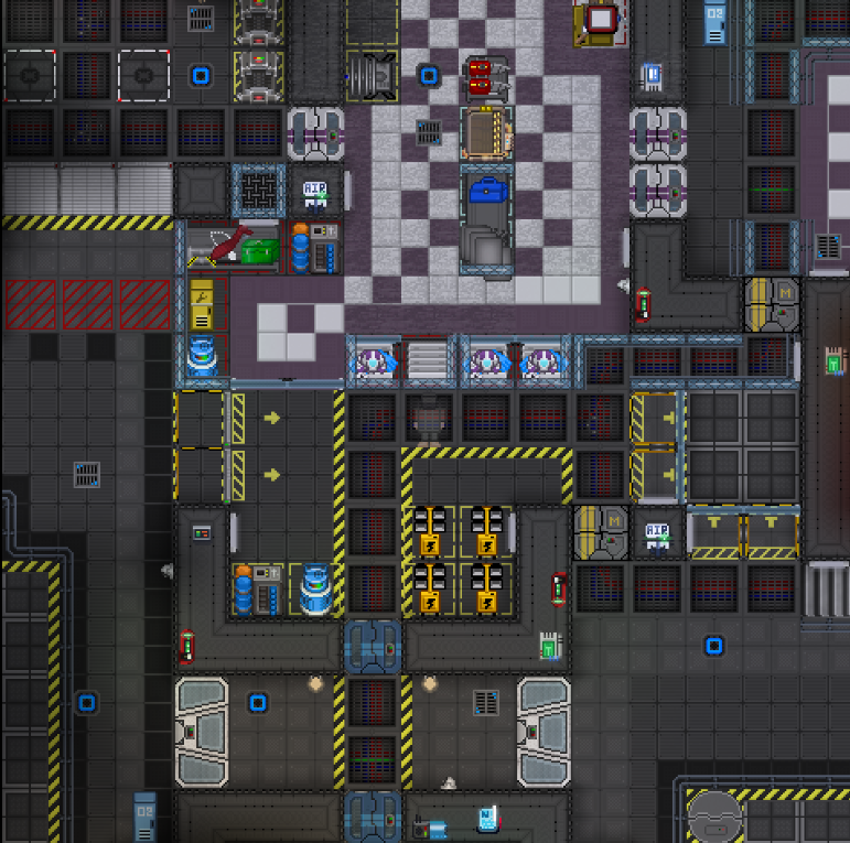
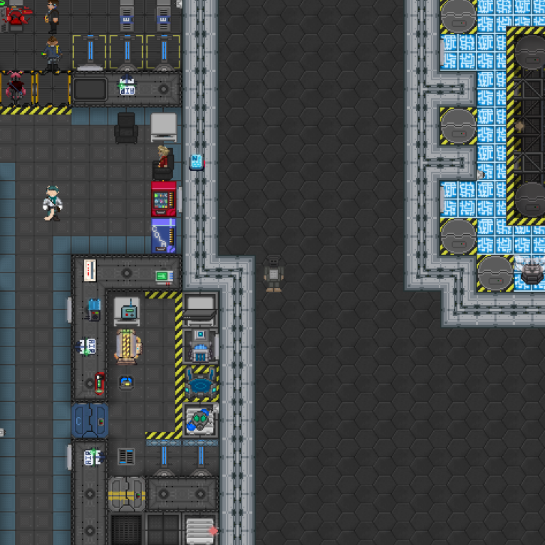
Another area that suffers from railings and windows is the science EVA preparation/robotics lift area. Does the table in the center really need glass walls for whatever reason? why is the elevator to robotics sealed off by flimsy glass doors while there's a full maintenance airlock and wall right next to it? Also the EVA area has shutters to close stuff down, but right next to that locked down area there's a flimsy glass wall that leads straight into the equipment area. Also why do the floorgrates in the area to the right require glass shielding and railings? Them being their would make it hell to drag push a bunch of stuff through the area and to also just makes no sense. I suggest removing the railings and glass on the room to the right, removing the two pieces of glass on the table, the window next to the shutters that lead into science EVA should either be replaced with a wall or a proper full tile window area which also includes shutters. The robotics lift should be fitted with proper elevator doors, or have the south windoors replaced with a wall and have no doors as the current windoors are just silly.
< the area to the right of science EVA. (those valves cant even be reached without having to jump over something.)
The robotics lab has some very annoying design choices relating to windows and railings again, why does the mechbay need to have windoors and railings to access the charging platforms? It only serves to make the lab more awkward and annoying to traverse, why does the counter area need to be sealed in its own glass area? It just makes it even more annoying to access and in case of some atmos failure it doesn't have its own ventilation or air alarm, also why are there pieces of glass over a WALL, as for suggestions, if possible it would be nice to see some proper elevator doors for the lift, and a call button that's not on the lift itself, turning the walls with glass next to them into proper full tile windows and moving the windoors in would make the area a lot nicer and make more sense, also the counter should have its glass walls removed as well as the mechbay should have the railing and windoors removed, also the lab needs a cell charger.
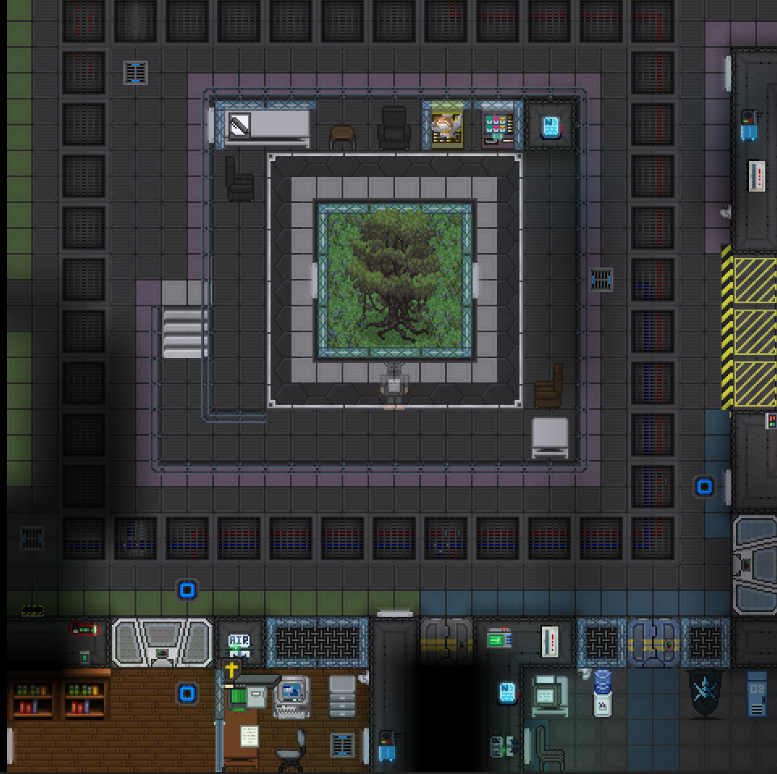
The central tree area confuses me, while I myself am not the biggest fan of the tree Ive seen others like it so I'm not gonna suggest removing it, instead I would advise to remove the weird railing spiral around it, it adds nothing to the area other then making it harder to sit down in the few chairs that are already there and instead allow the space to be used to make the tree area as a whole a better lounge are or something. Also again removing the glass around the table and vending machines would look much nicer.
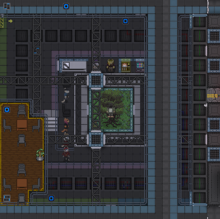
While im covering the central areas of the ship, I want to bring up the holodeck, the current position of the holodeck is really bad. On the Aurora it acted as a very nice gathering spot and social area due to its central location. As people were doing whatever in the holodeck people would pass by and see something interesting, Ive witnessed boxing matches that draw in new players, battlemonster games that people come in to view, and overall its just a great way to create moments for people to interact, the current central areas do not have this, the tree is a neat set piece but there's not much of a reason to actually linger around it, and the 3rd deck is a joke, the bar there is rarely used and serves almost no purpose other occasionally drawing some people away from the proper bar, so to remedy this I suggest the following. Fill in the 3rd deck and move the holodeck into the center, this way it still creates a open space while also giving people an actual reason to stay around, it also fits because the holodeck moves closer to the civilian areas like the fitness room and pools. ( and also it makes breaches on the 3rd deck less likely to turn the 2nd and even some parts of the 1st deck into vacuums! )
< Fill in and put holodeck here.
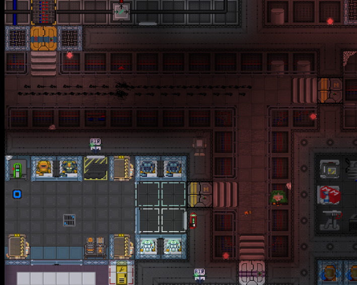
Maintence also has way too much railing, not only is it annoying for moving around, it also gets in the way if your dragging something and need to turn back or have someone pass by, I recommend stripping some alot of the railing to make it a less annoying and more traversable space. This issue is everywhere so I'm only gonna post a few pictures.
(whats with the random plating and rails? (and thats not multi-Z by the way)
What does any of this railing protect from?
I love everything about this tunnel except the railings blocking access to wires & pipes.
Another weird design choice is random Z-level overviews and holes around the ship. I recommend just removing them to make breaches between levels less likely and easier to fix, and to make the ship more consistent and less patchy.
This overview is just out of place, its not even looking over anything interesting.
And if deck 3 is breached it can spread to all the decks via this random overview.
These holes on deck 2 also serve no purpose and could lead to a multi deck de-pressurization easily.
This is another weird one, why not just fill it in and put some vendors or something? It would help with potential elevator traffic.
The last area im gonna cover is the AI core, I think its a downgrade in almost every way compared to the Aurora AI core, for some reason its spread between all 3 decks and doesn't have a backup SMES, I would suggest putting it entirely on deck 3 around where the current deck 3 part of the AI core is, theres plenty of space up there and it makes it a far easier to manage and more secure space as well as allowing AI shells and borgs to easily traverse it, Id recommend making the AI core pretty similar to the Aurora one as it was one of the better cores Ive seen on any server.
Make the AI core all on one level to the right area between crew armory & teleporter
There's more I wanna go over such as the new sprites and the engineering break room being in some dark corner no one will visit or tech storage being far away from engi, but this post is getting to long. I really want to make it clear I want to love the Horizon, but stuff like what Ive shown just makes the Aurora feel so much better, the Aurora map is the best SS13 map I've ever played, it had a perfect blend of z-levels and flat areas as well department spacing, and areas like the offices could look spot on to real life locations, I really hope that the Horizon gets refined more and ends up having the same qualities that made the Aurora so nice and functional!