.png.2a7a40735e452382f4f5d29ce64eb4b9.png)
wowzewow
-
Posts
504 -
Joined
-
Last visited
Recent Profile Visitors
16,471 profile views


wowzewow's Achievements
Captain (28/37)
1
Community Answers
-
.thumb.png.b1ceb31a90116a77dd68593b551380db.png)
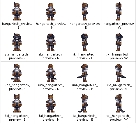
Wezzy's custom items and sprites (for other people)
wowzewow replied to wowzewow's topic in Hobbies & Interests
Custom items for myself
-
Wezzy's custom items and sprites (for other people)
wowzewow replied to wowzewow's topic in Hobbies & Interests
Bump. Hangar Tech suits (For TGW) Zavodskoi Prosthetics (for Borya) Grupo Amapola uniforms (for Necuametl) Reade/New Gibson stuff (for Kermit)
-
Oh, to specify, "unable to be ripped off" should be "unable to be harm-intent ripped apart as a poster would". You can only take it down by using tools.
-
The Dominian Greatcoat? and nothing else. Pictured below.
-
Could be a toggle.
-
Codebase policy regarding shirts and pants
wowzewow replied to greenjoe's topic in Policy Suggestions
I agree. -
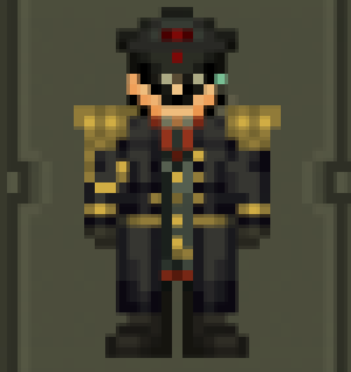
BYOND Key: Wowzewow Discord Username: alsoandanswer Character Name: Zhong-Zheng Zhao Item Name: Epauleted Greatcoat Item Function(s): Counterintuitively, coded like one of the capes, so he can attach it over his suit accessories. Item Description: A normal greatcoat with a rather dated Parade accessory attached, long decommissioned. Brings a warm nostalgia to some, confusion to others. Why is your character bringing this item to work?: "You know, the first thing that happens in a confrontation is how you present yourself. Having broad shoulders helps." - Z.Z. Zhao, on escalation. How did your character obtain this item?: "I got it as a gift from a family member." What value does this item have to your character, and what story does it tell?: "Well, it looks absolutely dapper. Reminds me of home. You know, Napoleon had one of these." Sprites: ZZZhao_Epauleted.dmi Additional Comments: I'm evil.
-
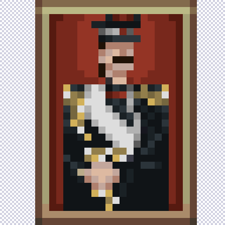
BYOND Key: Wowzewow Discord Username: alsoandanswer Character Name: Zhong-Zheng Zhao Item Name: Portrait of a Zhao Item Function(s): It's a poster, basically. Except it can't be ripped off the wall. It's a framed painting, after all. Item Description: A painted portrait labelled as "Z.Z. Zhao". Why is your character bringing this item to work?: "Well, the Nobility's got to show some degree of pomp and circumstance." How did your character obtain this item?: He painted it. What value does this item have to your character, and what story does it tell?: "Both the Martial and Literary arts must be achieved together - that is the essence of being a true Gentleman. One must master both the Sword and the Pen." - Z.Z. Zhao, when asked about his downtime as a Head of Security. Sprites: ZZZhao_Painting.dmi Additional Comments: Wow. I feel super powerful making custom items for myself.
-
Thanks for the feedback
-
Stuck near and around the Not-Pannonian Plain in the legally distinct Not-Austria-Hungary-but-Not-Kinda-Rome, lies a small borderland village. Fertile soil, Virgin (probably) land (totally not stolen). Ready for settlement! The Feudal Society (Departments) - The Rhaetians (Command) Rich from their many gold and silver mines and well protected by their mountain passes, lower nobility come down to rule these peasants and collect taxes. - The Illyrians (Security) Generations of families that have lived in the hills, fighting off the vile Huns and Turks. Their duty is to protect the town, but loyalty can be fickle if the pay dries up... - The Venetis (Engineering-Cargo) Merchants, artisans, craftsmen. Making a hell of a killing selling spices and goods galore. Although, radical thoughts of Republicanism stir within...will there be a free Veneto (Cargonia) one day? - The Umbrians (Med-Sci) Clergy from The Big ChurchTM, they're here to spread the good word of God. And provide leeches and bloodletting to those who need it. - The Pannonians (Service) Regular old peasant folk. They just live here, man. The Vile Invaders (Antags) - The HUNS! Tremble at their horses! (Mercs) - The TURKS! Cower at their great bombard! (Nuke Ops) - The GAULS! Hey, what's that magic potion they have? (Ninjas? Wizard?) The Events - Hey, some smelly man from Germania nailed a piece of paper to the church door... - You know, the Turks have an interesting religion. If we convert, they promise us a discount on spices and carpets... - The Noble With No Heir : Who wants to get adopted? This is stupid.
-
Ckey/BYOND Username: Wowzewow Discord Name: alsoandanswer Position Being Applied For: (coder, mapper, spriter) : Spriter Past Experiences/Knowledge: Dreammaker, Aseprite, Visual Studio Code, Sourcetree, Fork. Examples of Past Work: https://github.com/Aurorastation/Aurora.3/pull/22490 https://github.com/Aurorastation/Aurora.3/pull/22513 https://github.com/Aurorastation/Aurora.3/pull/22528 https://github.com/Aurorastation/Aurora.3/pulls?q=is%3Apr+author%3Aalsoandanswer (list of pull requests you made to the Aurora repository or other relevant work) Additional Comments: IDK
-
To be fair, Vamp and Cult conversion is pretty damn rare nowadays, and even Vamp thralling has been (mostly) removed since literally controlling someone else has been unilaterally decided to just be horrendously bad. Cult is in a strange spot because I don't think I've ever seen a Cult round played in like, ever. Conversely, is a Captain or HoS going to willingly even expose themselves to a Cult-like event? A Captain or a Hos isn't going to roll over for a Merc team, I don't see why a Cult would be different. "Playing along" doesn't mean roll over and let them kill you, it's more of "Allowing them to pull off their gimmick instead of immediately sliming them" Seeing that these are non-canon anyways, it's very unlikely to break the server. You can't really one-man-army greytide murderbone people like in MRP servers as a Captain or HoS in Aurora. In a post conversion Aurora, we don't really need the "anti-conversion thing" because we aren't really converting people anymore. ...also, I feel like this could probably be lumped in with the skill system. Call it "Volition" or something.
-
Personally, even though, RIGHT NOW, we're under the heel of SCC or whatever. But knowing NBT2 is afoot, at this point I feel like we can just start moving towards casting off old stuff like this. We're eventually going to get rid of this anyway, so why not now? We don't really need these LRP hard-coded limitations anymore.
-
As a Player, what I feel is important for Vampire to have is inconclusive results. I think the difference between good and bad antags lies in the ability to have endstates which are non-binary. For example, Mercs rounds typically don't end in the complete slaughter of Security or Mercs. It's typically a jumble of both sides losing a couple of people before the Mercs decide to cut their losses and hightail it out, or the Horizon cutting a deal with the Mercs. The issue of some Antags are that they are all-or-nothing. They don't really have an escape route, so they're locked in the Horizon ragecage until either THEY die or the ENTIRETY of Sec dies. Which I feel contributes to the disdain of the Gank and Genocide Antags. As an Antag, there should be different playstyles and paths. Ling and Vamp inherently attract combat junkies which are kind of antithetical to the Aurora playerbase. Here's just a rough example of what I have in mind. - Feral Basically, the Kill People Ganker playstyle. What we have right now. The goal is to feed your bloodlust and move on to the next ship. As a side note, it would be nice to have a option to avoid the "early game" of Vampire, and just sit dormant until near mid-round - to get consistent, but slightly weaker powers Some security heavy manifests lead to a lot of on-ship Antags just dying immediately in the first 30 minutes, leading to it being basicaly an Extended round. Early detection and late-game power needs to be HEAVILY scrutizined, since an Antag with no early game is basically not an antag at all. There also needs to be an actual end-game, or else it's going to fall into a ragecage where the Vampire is forced to just ride it out and slaughter as many people as possible before dying. Which is kind of stupid. Probably have it be like, 10-20% of the crew dead, then try to GTFO. Gives tension on both sides to get things going rather than open-ended murderbone. - Aristocratic The Roleplay playstyle. Soft-thralling, charisma, basically Revs. The goal is to control a sizable portion of the ship or to obtain Head of Staff status. Roleplay is very open-ended so I can't really say how it's going to go. EDIT : - Assassin Thief A mix of both. The Ganker/Thief playstyle. Killing people outright is pretty abhorrent, but something along the lines of stealing blood, non-vital limbs and organs seems like a good compromise. Use your cunning and guile to trick people, and steal valuables aboard the ship. Steal an important thing from a Head of Staff, or siphon X amount of credits, get an X amount of net worth, GTFO to win. As a non-Antag, it's important to balance the early signs as much as possible. Because in most cases, it's going to be "I'm going to die in 5 seconds", or "I have to meta-pretend I didn't see that so the Antag doesn't die in 5 seconds" Probably balance it out with "Feral" playstyles being more loud, while "Aristocratic" playstyles being more quiet. And probably having each job having special counters to Vamp, like Chaplain. A lot of work, probably saved for some other time. This could probably be worded better but this is just stream of consciousness.