AmoryBlaine
Members-
Posts
1,470 -
Joined
-
Last visited
Content Type
Profiles
Forums
Events
Gallery
Everything posted by AmoryBlaine
-
Aurora style upgrade (Jackets, jeans, etc)
AmoryBlaine replied to BRAINOS's topic in Completed Projects
Seeing these closer up. I like the back of the bomber jacket. The military jackets- Not that big a fan of them. They look like shirts, more than actual jackets. The current ones- and ones I'm adding more proper variation of- seem to be based of M-65s, or something. The new pants- are interesting, but they don't really fix the ever present issue of pants looking like they've been made with MSpaint's spraycan tool from the sides- though, I've yet to touch the jeans, so I'm not particularly sure as to how to fix that issue yet. Overall- while the EVA suits you've done fit well- these seem to deviate a bit. The flight jackets- green especially- seem saturated heavily. The leather jackets seem too flat. More variation welcome, but- I don't know, actually. These specifically seem very odd looking due to the aforementioned saturation and flatness, or over pixelization of certain chunks. Is the t shirt on the guy a part of the jeans? -
Aurora style upgrade (Jackets, jeans, etc)
AmoryBlaine replied to BRAINOS's topic in Completed Projects
Everything is tiny. Also, I'M DOING THE SAME THING. -
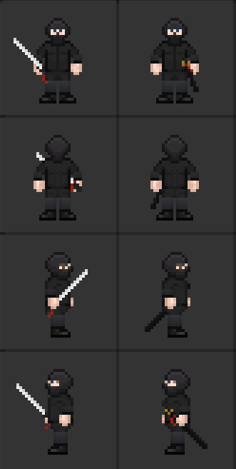
@Butterrobber202 It's literally already in the game. The changes are so tiny- the leg and arm wraps, are the only visible change- that this was more just to showcase the Katana and let me fix the minor inconsistency across my earlier sprites on the ninja variant. @BRAINOS Post your version here, since I do think it should serve as an alt for the ninja if they choose not to go Cybersuit.
-
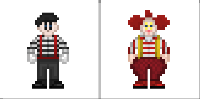
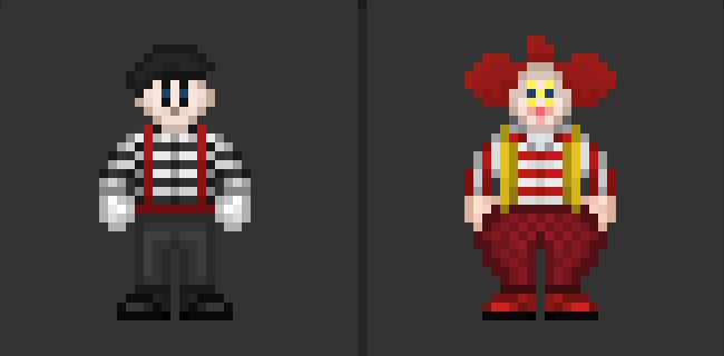
Because I'm lazy, essentially. The actual shirt was from my pirate resprite. I'll fix it later. I might add strips, I might not. Unsure what I want to do with them, currently. It's actually- if I get my way- going to be seperate makeup kits, or a single kit that when used like lipstick prompts one of the two options. If I really got my way, I'd rather we just delete the clown/mime sprites with the next clean up of clutter. But yeah, this should better group these outfits in our artstyle. The current ones are way too out of date.
-
We can make an alt, if you'd like. Suggestions are always open.
-
Essentially, yes. It's just a slightly varied undersuit. We have nearly the same thing currently, but I need to replace it anyways because of a design inconsistency. So this was my idea of a variation of it to have replace it.
-
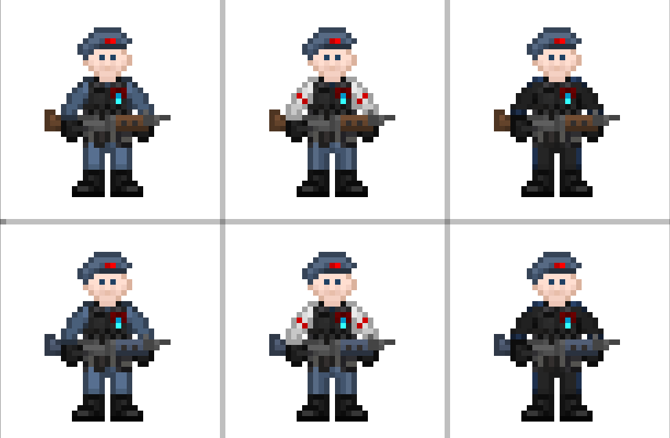
What is the UPP? It's not particularly contemporary, just, less specific. It lacks the connotations of Mercs being a Syndicate force, that comes with their current look.
-
I'm not making female versions of either. There's no real need to gender the costumes.
-
Okay, I lied. There's actually a lot of jumpsuit resprites. If you want to see one closer up, just ask.
-
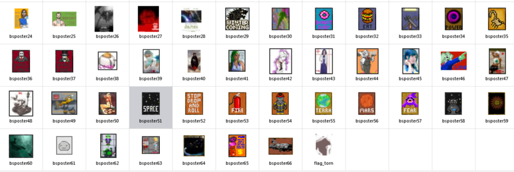
How many of those are copypastes of the sprite onto a poster? How many of them have a word taking up 1/3rd the poster? Just in case you missed what I said. Trying to focus on what fits and is legible to us, the players, limits us. Copypasting sprites into the posters, is just lazy, especially when all that does is make 1:1 images of items, which- again- is for us, the players, for some reason. I do not see why we need a 1:1 legible and 'photorealistic' image of a burger sprite, when these are IC posters.
-
-
I think the majority of you fail to realize that we've got 22x28 pixels of room to make the posters. If you want to read words off them, you're not getting many words on their. Why do you think most signs are 4-6 letters long, or make up for missing words with symbols? Also, what do you think the other posters look like? They're tiny-fied photos, sometimes with SS13 stuff plastered on.
-
The writing being illegible is by design. We can't fit much writing on things, so it's better this way. Leave the words themselves to the descriptive text of each poster.
-
It's fairly simple. All of the other ones, aren't our's. We have the capacity and the skill to make our own. Plus most of them aren't that good anyways, or relevent to the setting.
-
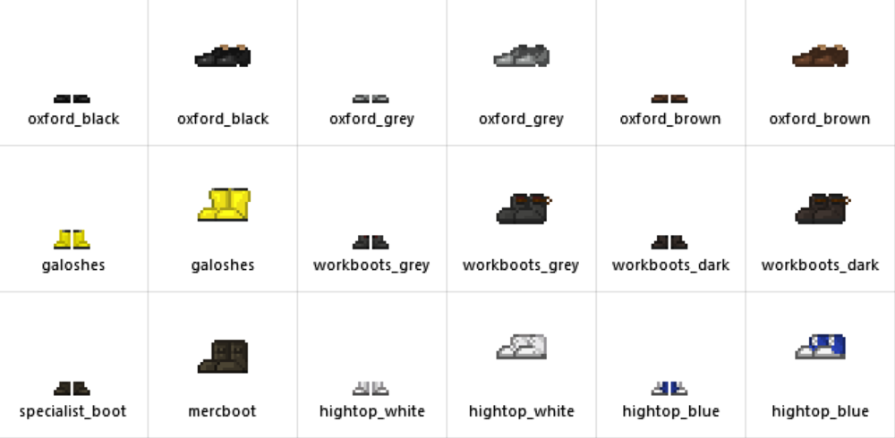
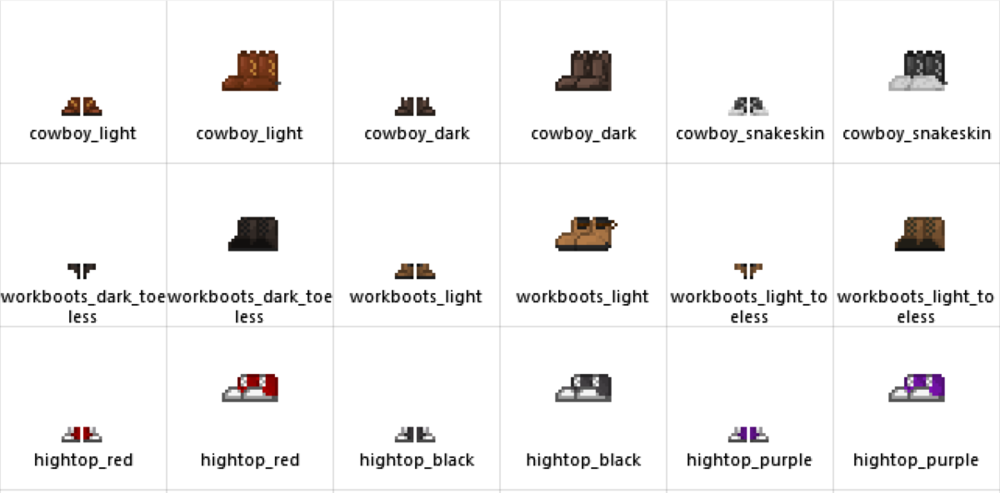
Those shoes are my replacement for the laceups. They're black oxfords. There's also grey and brown.
-
-
-
The blue is out of place, since the rest of the RD options are brown/tan with green or purple accents.
-
What colour do you think would work better?
