Zelmana
-
Posts
374 -
Joined
-
Last visited
Content Type
Profiles
Forums
Events
Gallery
Everything posted by Zelmana
-
NexusCorp still under/misidentified in these latest PR changes. Just because it's black doesn't mean it should be labeled Necropolis.
-
goolies
-
Make no mistake, Reds. The Xanusii is merely a SolGov mouthpiece. A corpse mockery of free thought being puppeteered as independent.
-
The problem is that you must become more robust.
-
Something I will add- I don't like the blue. My sec characters are Nexus Corp. I don't care if we removed the word "Eridani" from it. I still show up to work in not security blue, but Idris blues. A reminder to those spriting that Nexus Corp as well as other subsidiaries of PMCG are not Eridani based.
-
Why were some investigator things touched? Now instead of an ubiased source it looks as though we have no option but to look like Idris shills. Hardly any options for PMCG. Removal of the hardworn and black suits- why? Investigations has always been a "you're a detective, you don't have to wear 100% cop uniform" This whole step away from black is sad and I think fun police. No, not fun police- because that diminishes whats going on here into a simple binary option of us vs them. I think what's going on here is an attempt to have some corporate unity but that comes at the price of character customization and uniqueness. As a heavy roleplay server we should permit character creation options within a certain degree of flexibility, and what's happened here is clearly crossing a line of uncomfortability for a lot of people. How far will character creativity be pushed back for the sake of corporate unity at the cost of player retention and overall aesthetic choice?
-

Head of Security begone: Long live the Chief of Security.
Zelmana replied to KingOfThePing's topic in Archive
Ty Marlon. Didn't mean to sound so pushy up above. I think it's odd that we have a medical person at the Officer level. I believe that's why in lore they're called "Directors" even though that's organizational leadership lingo. Medical is like a support staff in a way. A fully capable hospital, yes... but it's hard to chart it. Since hospitals are ran very independently internally they are fine with having a "Chief" Medical officer as that has been a thing always running the floors. So hospitals will have a Chief Medical Director on the board instead of most of the other titles like COO CIO CTO and such, they don't have a CMO on board because that's their director level shit. So they call it a Chief Medical Director. Basically hospitals do a flip flop usually in naming schema for officer & director. There's a bunch of other oddities in our corporate lore but yeah. Obviously a multi-sector corpo is a spaghetti mess. -
Head of Security begone: Long live the Chief of Security.
Zelmana replied to KingOfThePing's topic in Archive
@Marlon P. I think the chart is a bit misleading. My post above and the chart can't both be true. A chart based on the info above would look more something like this-
-
Head of Security begone: Long live the Chief of Security.
Zelmana replied to KingOfThePing's topic in Archive
I'd also add that the board of a company this size would be consistent of former CEOs, current CEOs of other companies. Typically a CEO will not only manage their own company but serve on the board of complimentary companies where they can all orchestrate similar change. A CEO of a huge company will dedicate their entire time to running their own company, but will be supported by smaller companies CEOs and other officer-levels, most often also from their own company. -
Head of Security begone: Long live the Chief of Security.
Zelmana replied to KingOfThePing's topic in Archive
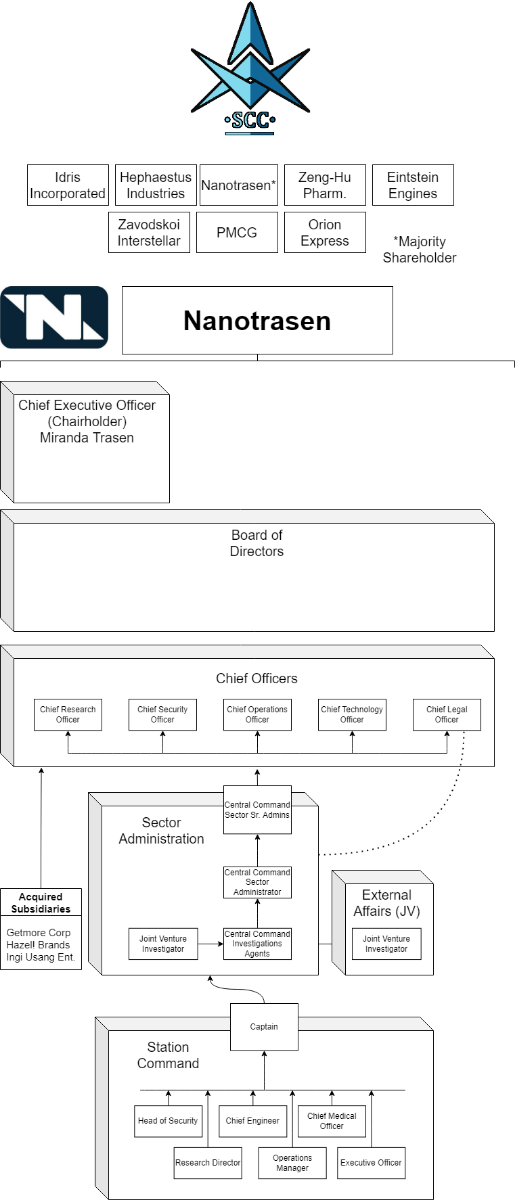
I would say that with my corporate experience by no means are Command "lower management". They are organizational-director level management with the Captain of each vessel / station being organizational leads. In fact the whole upper management schema in lore looks like it was designed by someone who isn't all too familiar with corporate structuring. The directors not being on "the board of directors" is proof of this. For example of a traditional organizational structure. I'll use a fortune 500 example of a possible department. Let's go with cybersecurity because that's definitely not what I do. There's an average employee. They have a manager who manages a few people. This could be a group that has a specific task like managing cybersecurity risk via a certain function. There exists an organizational-level director manager that is over multiple groups that serve a purpose of "risk management" all being in the same logical group function, let's say Risk Management as a whole. Multiple group functions with their individual org-level directors report to a Sr. level director or someone with a catchy title. This person is a Chief. Chief of Information Security, let's say- a CISO. Below them is the tier below- the directors. One for the risk management, one for operations, one for engineering, one for... and so on. Now this organizational director is likely not important enough to be seated on any board, but they are "Senior leadership". They routinely can talk to the CEO and CIO of the fortune 500. The organizational director, the CISO, typically reports to the CIO, who is in charge of all of IT. They CIO is a member of the board of directors. The BoD has other officers such as one over supply chain, one over manufacuring, one over research, one over HR, one for corporate, etc. They are headed by the CEO who also typically has a seat or a weighted vote of the board. In SS13 perspective, the optimal solution would be to treat Command staff as org. directors, the Captain as a organizational leader. Station Command is a bit of an oddity. Both "Central Command" and the CCIA/CCSA should exist in separate upstreams of a corporate business unit, while still remaining superior and over the rank of organizational leadership such as a Captain or whomever is operating an NT business facility. Respectively then the Captains would report to their specific Station Command Officer who orchestrates data, objectives, etc to the entire company-level directors. Most of these directors should be heading business units and should also be seated members of the board (but not all of them on the BoD). I fairly regularly report data and analytics presented to the BoD for a fortune 500 company ranking fairly close to 100. -
My Nexus Corp PMCG officer is spawning with Eridani gear, and there's no non-corp affiliated berets.
https://wiki.aurorastation.org/index.php?title=Private_Military_Contracting_Group#Other_Private_Military_Contractors -
What are you computer specs as well as network connection speeds?
-
Head of Security begone: Long live the Chief of Security.
Zelmana replied to KingOfThePing's topic in Archive
Problem to me is that CSO is a corporate term akin to CISO, CIO, CEO, CTO. It's a terminology which usually indicates they're either on the Board of Directors or are in upper management. Chief Engineer and Chief Medical Officer are both team-lead descriptive roles, both in game and in the real world, unlike the CSO position. -
I have interacted with Bisenti for a long time, likely since his first sec days. For the sake of the app, I would be interested to see another character be played. From experience, HoS/Commander is one of the most stressful roles in both roleplay ability and "getting the job done". Mentality of making the round better for people vs. winning is something to keep in mind. As with a lot of Command, learning not only to do just the job, but also play a great character is something that is hard to do for some. Perhaps playing another character to showcase your breadth of roleplay ability. I see only two characters on your rooster, and while I believe that Mike isn't just a self-inspired character, playing something completely different would showcase your HRP skills. Doesn't even have to be command. Janitor, for example, is almost entirely roleplay driven as opposed to things like HoS where you balance what needs to be done in game and what should be done to drive and create an interesting round.
-
Head of Security begone: Long live the Chief of Security.
Zelmana replied to KingOfThePing's topic in Archive
A lot of people call the role Commander. Why not change it to that? I hardly see anyone calling them "Chief" other than a petname or something akin to "Big Boss" style connotatively. -
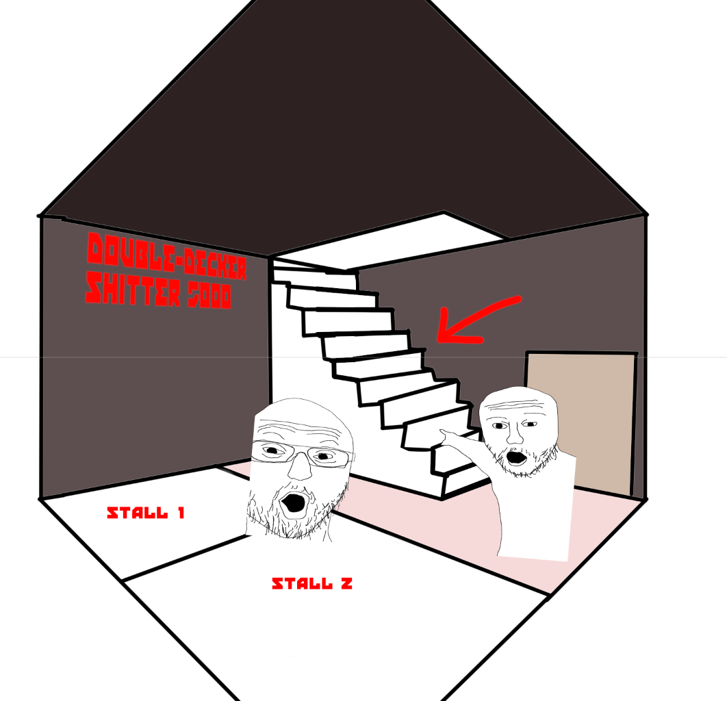
Sorry for the mappers reading this. Please note my intent is to provide helpful feedback. I am a very blunt and technical person so please don't read any sort of ill-willed tone in this. The central atrium is very confusing. I like being able to look down. However, From the top floor it looks very messy in terms of z-levels. The central park area is nice, but the railing are not needed. This is a specific complaint about a broader dislike of the map- the needless stairs and "fake" z-level changes seemingly everywhere. During one of the test rounds I asked a few in LOOC if they could tell the depth/perspective, mainly from standing around the coffee area. It just looks confusing with all the rafters and railings. Some simplicity in this area would be better to convey how deep things go. No faking z-level here would be preferred. Continuation from this, the catwalks/partitioned and glassed-off walkways on the side of the levels here. It's odd. What are their purpose? Functionally, it is on the same level as the flooring surrounding it, but there is a tile missing with railing all over. Why not just make the flooring go all the way to the walls? I'm lazy, and the map isn't up right now, but picture something like this: And with it surrounded by railing, I just don't get it. It uglifies things to me. Again, the whole center atrium z-level perspectives need some work. The legitimate z-change in one of the restrooms is odd. You enter the restroom via a door, and in the area before the stalls there is a staircase. Double-decker shitting? No. It leads to directly into a hallway above 1 z-level with no entryway/door. The best way to explain my pain of this restroom is through memes.
-
Paul Bird was right all along and THEY nuked Mars.
-
And if people are concerned that "well that just means that players who have remained here and not left the server will be prioritized". Good. They should be. I don't see why we should permit these characters to have a staff gold-standard of roleplay if they have not demonstrated that ability in over a year. Especially with all the mechanics and lore changes.
-
The solution to all these "would-be-returning" players discussing how this will impact them have a solution. Play. Return early. If you are so concerned about losing your privileges of Command due to being away for so long... return early and catch up. My main concern is something others have stated here as well- a returning player playing a whomegalul or returning a big-wig character. Where have they been? Are they caught up on the events that have been happening? As much as I'd like to say I trust our whitelisted people to catch up on lore and even reintegrate into the server correctly after an NBT I don't. Command should at least stay relatively active. If you haven't played in a year that's crazy. Hardly anyone will recognize your character. Command is typically played by characters who have in-game developed over time into those positions. If no one but 1 person out of a potential 60 person lobby in NBT recognizes you- that's kinda sucky. You're removing the ability for a well-established (and not just well-established, but well-maintained and continually well-known) character to be in the round.
-
I support this for the simple reason that I think we will be experiencing an influx of returning players and it would make sense for there to be a reintegration period before letting them play their Captain player. You know. Piloting a ship. Policy changes. etc.
-
What about a crowd? This seems like it could be abused as an instant-stun/downer. Shooting at me? Okay, I'll just run into you and you'll drop your gun.