.png.2a7a40735e452382f4f5d29ce64eb4b9.png)
wowzewow
-
Posts
490 -
Joined
-
Last visited
Content Type
Profiles
Forums
Events
Gallery
Everything posted by wowzewow
-
Why the fuck do I have to pee so much every day this is very inconvenient
-
I say we remove the events. Keep the code n' stuff in game, let the department be remapped into an abandoned-ish section Like, sure, you can still do virology, but on a shoestring budget. But it won't be an actual thing that people are gonna do.
-
I'M FINNA MAKE AN ANNOUNCEMENT : SHADOW THE HEDGEHOG IS A BITCH ASS MOTHERFUCKER
-
a simp has fallen for a e-girl in lego city - start the new thot patrol
-
...It's a problem. That's why I brought it up. If it "doesn't matter" I wouldn't even have brought it up in the first place. Also, less visual space. I hope you like your blue floor squares even bigger.
-
It is 4PM. All users with Anime Girl Profile Pictures are to report for immediate dick flattening
-
Not feeling too hot on the new wall sprites. They are a frankenstein inbetween of the perspective top down walls and our current ones. Reference image. I can see what the new walls are aiming for - the cool perspective of ERIS and BAY. But the corners don't go all the way, it's too afraid to commit to the new style. So it's this weird inbetween. Make the corners go all the way down, please. Also, the reinforced walls look way too similar to regular walls but with a dot in the middle. Next up, the vents and holopads. Left is the old ones, right is the new I don't know, it feels like a straight downgrade to me. The vents are less detailed and spinning the wrong way Again, less detail (and making engineering a little harder to click the damn thing) These changes are good, yes, but they still need a little more work put in to be great. Just calm down and pull the handbrakes for a bit and we should be gucci.

-
They look like barrels NGL
-
-
alright then ill work on the new version I was just trying to make sure that this wasn't just some knee-jerk reaction. Yeah, I fucked up. I'm sorry.
-
Alright, noted I'll just need to know what things from BRAINOS' sprite I need to put into mine. That's all I'm asking. "BRAINOS IS BETTER" is literally not useful, constructive, or conducive in any way. I'm not here for some popularity contest, just trying to make good sprites. pm me, tell me what to do
-
Archiving cause this already exists
-
I think the gradient for the color is a little bit too smooth, but looks pretty good. I don't know about you, but the pink looks more like cherry to me.
-
I am motioning for a close on the revert PR, as the current one in game is pretty much OK because no one really bothered to object any further after the initial outcry.
-
.thumb.png.b1ceb31a90116a77dd68593b551380db.png)
Final Suggestion: Let Skrell Squeeze Through Closed Airlocks
wowzewow replied to a topic in Off Topic Discussion
wetskrell must have some funky shit -
pretty sure people steal those from work IRL, not bring them from home
-
Lower the volume of the Supermatter Crystal's humming
wowzewow replied to furrycactus's topic in Archive
https://github.com/Aurorastation/Aurora.3/pull/8357/files maybe this may be the culprit? idk -
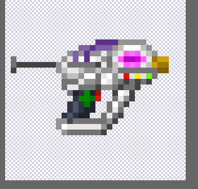
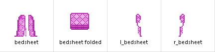
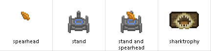
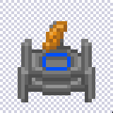
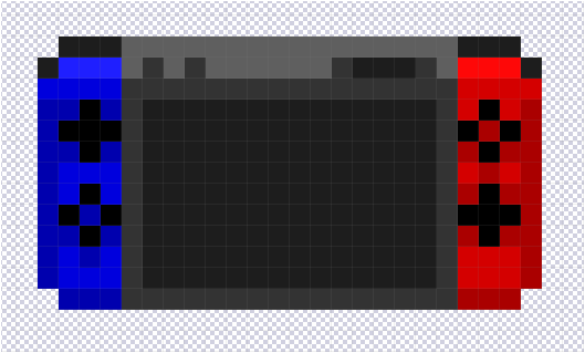
Hey guys. Resident Spriter man here. Just here to dump some sprites I made for some other people. Yeah, I take commissions. Contact me on Discord through my handle : alsoandanswer#6999 I'm most active there for communication. An oversized warm, fuzzy bedsheet for Olivia's psychiatrist Skrell. NiennaB's IRU-Sentiment's Chrysanthemum bouquet. Tokash's Spearhead display stand thing, and his mounted Shark jaw. (in hindsight, that's actually pretty damn metal.) hah, just look at thing go. hee. Oh yeah, I also made a Nintendo Switch for my character. (before forgetting about the thread and having it uneventfully closed)
-
wait, gloves can slide over rings? since when?
-
alright seems good dude I'll put a hand in respriting things as well If I have some time to burn
-
Are you deleting this? Please don't. It's fine as-is. It's small and simple, and OK in my eyes.